

The beginning…
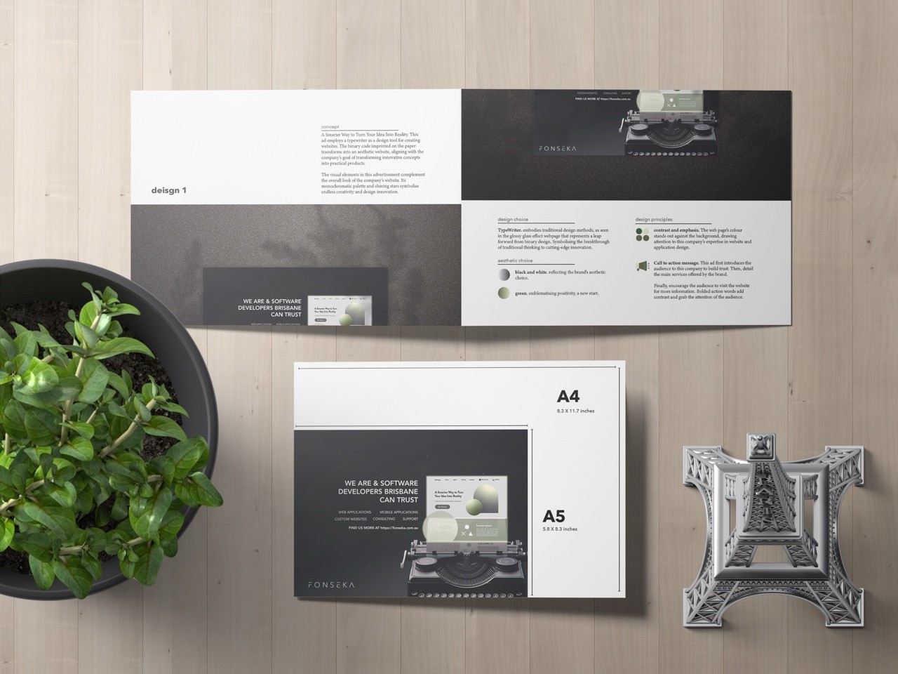
This A5 poster was designed for an interview case study. The task was to create an A5 magazine poster for an IT company that would give prospective clients or contacts a quick guide to their services and an impression of the company. The company has a very elegant black-and-white theme, focusing on space and innovation.
This A5 poster was designed for an interview case study. The task was to create an A5 magazine poster for an IT company that would give prospective clients or contacts a quick guide to their services and an impression of the company. The company has a very elegant black-and-white theme, focusing on space and innovation.
This A5 poster was designed for an interview case study. The task was to create an A5 magazine poster for an IT company that would give prospective clients or contacts a quick guide to their services and an impression of the company. The company has a very elegant black-and-white theme, focusing on space and innovation.
Inspirations
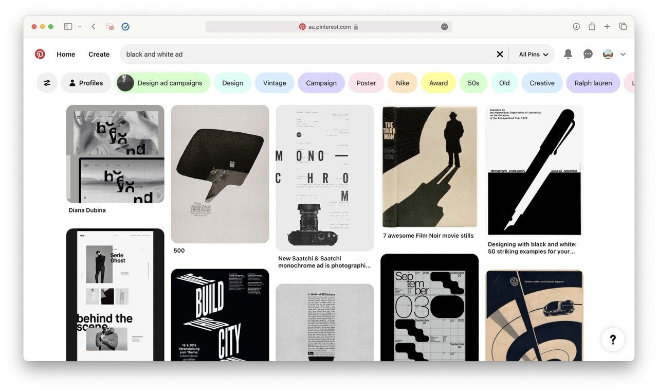
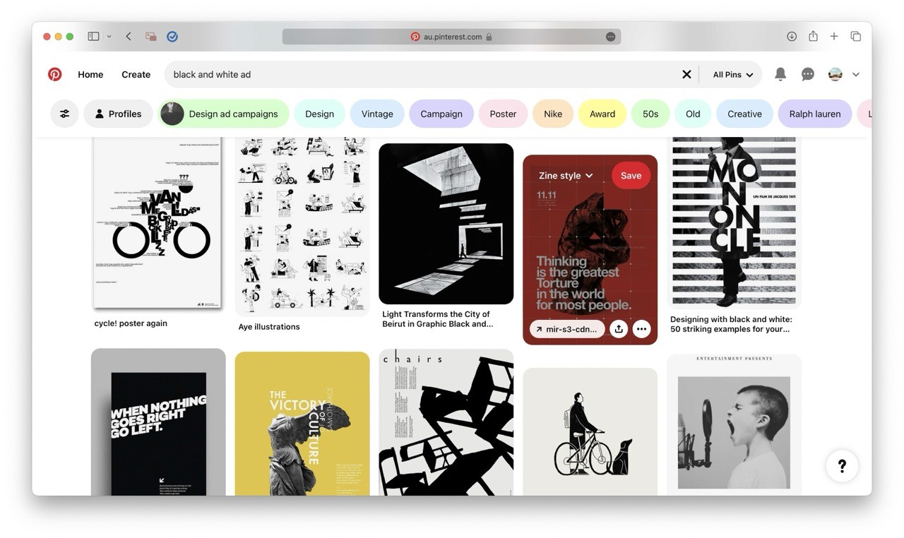
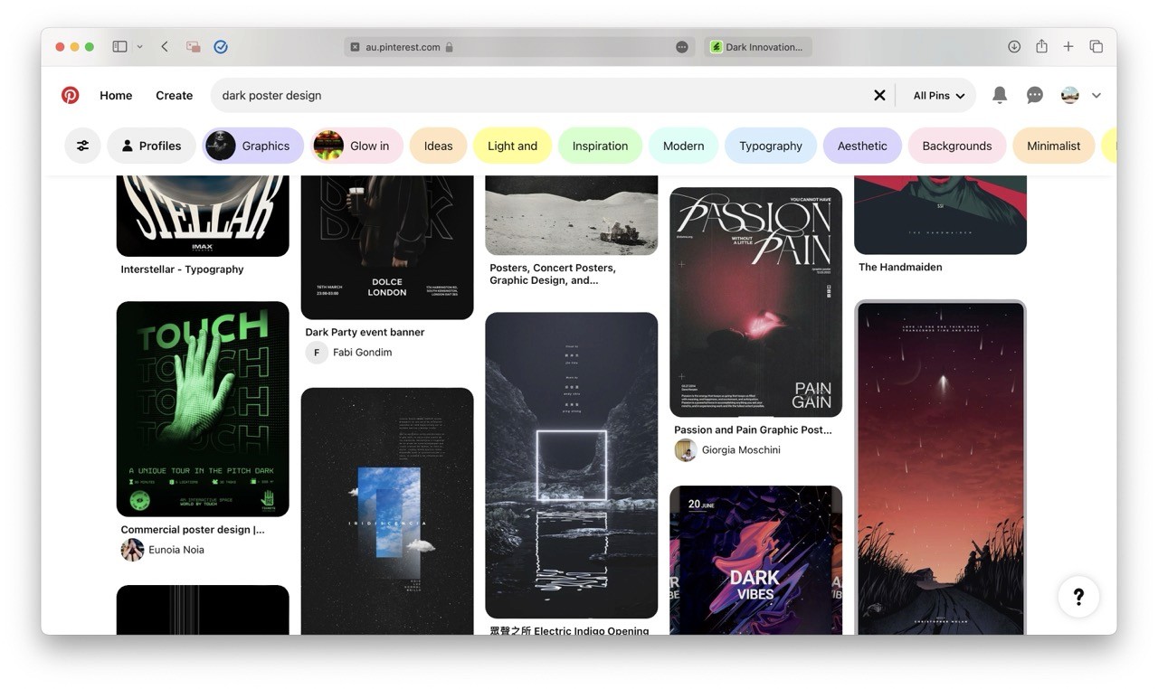
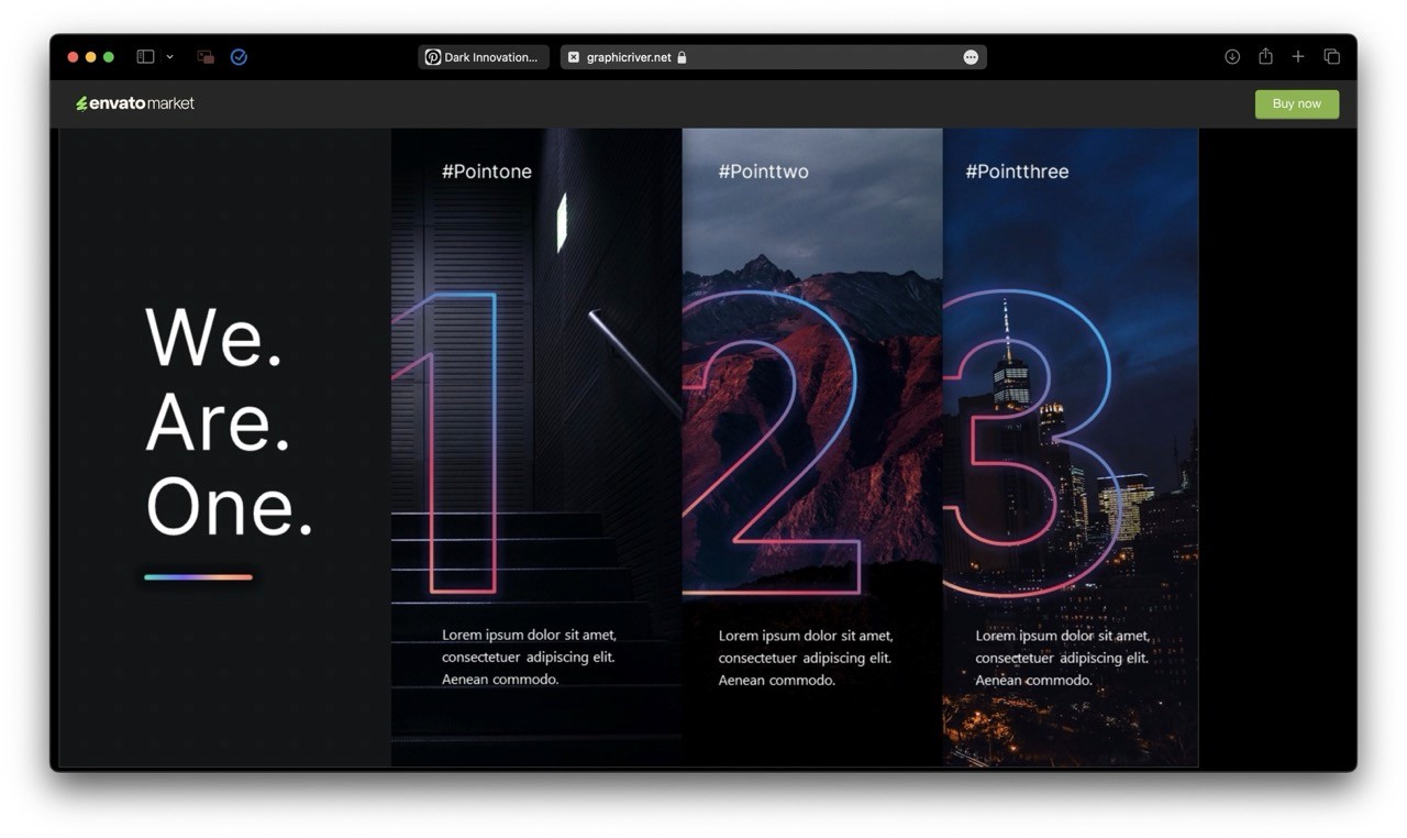
I began by researching black-and-white poster designs that convey an elegant, abstract feeling. Inspired by this, I started my first design by playing with the company's logo characters, surrounding the company's motto is "A smarter way to turn your idea into reality."
I began by researching black-and-white poster designs that convey an elegant, abstract feeling. Inspired by this, I started my first design by playing with the company's logo characters, surrounding the company's motto is "A smarter way to turn your idea into reality."
I began by researching black-and-white poster designs that convey an elegant, abstract feeling. Inspired by this, I started my first design by playing with the company's logo characters, surrounding the company's motto is "A smarter way to turn your idea into reality."


The first design
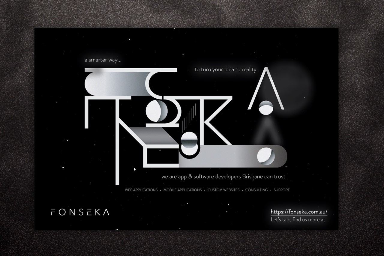
Explosing my small universe concept where I shaped the company's characters to metaphor the “factory line”. Transforming the character "o" metaphorically represents a product being polished and refined in the factory process, and ended up used as fuel to launch a rocketship. This metaphor suggested that the company could turn a client's product into something fantastic.
While creativity is always good, the outcome of this design was so abstract that even I wasn't confident it could effectively deliver the intended message. However, it was a good start, and I treated it as a brain warm-up and a milestone to see how far my graphic design skills had progressed.
The client didn’t come with a brand-style guide at the beginning. We initially picked Eminence - the purple colour of the NDIS logo - as our main colour. I put together a mock-up, but it didn't quite hit the mark. The design felt a bit clunky and not engaging enough.
So we pivoted. Our next attempt was a more solid but elegant style, sticking with purple but incorporating more white. This became the first real design of the website.
Set off for a new design idea…
I then delved deeper into studying the company, focusing on its services, products, target audiences, and LinkedIn connections. I discovered that they prioritise service quality and largely focus on web application development through the company's SEO websites and listings.
Although their services ranged from application development to business consultation, I decided to narrow it down to promoting one service and emphasising it with the company's motto, "Turn idea into reality in a smarter way."


More inspirations…
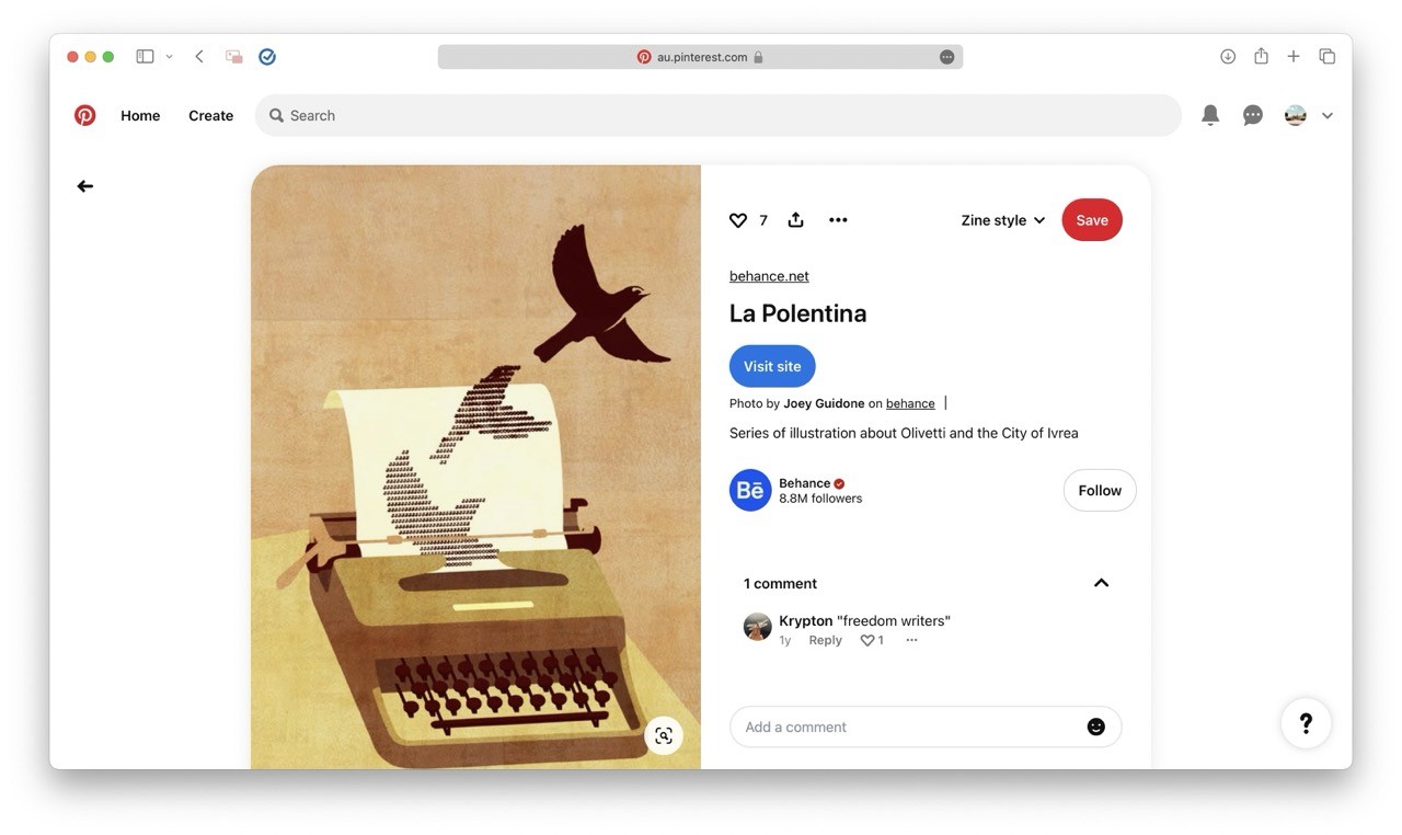
During my research, I came across a Pinterest post showing a typewriter that had typed a character into a bird shape, transforming it into a real bird at the end of the paper. This inspired me to visualise "turning an idea into reality." I thought, what if I had a website shape typed on a typewriter that then popped up with glass effects? This concept also aligned with the company's service as app developers who code. This inspiration led to the final design.
During my research, I came across a Pinterest post showing a typewriter that had typed a character into a bird shape, transforming it into a real bird at the end of the paper. This inspired me to visualise "turning an idea into reality." I thought, what if I had a website shape typed on a typewriter that then popped up with glass effects? This concept also aligned with the company's service as app developers who code. This inspiration led to the final design.
During my research, I came across a Pinterest post showing a typewriter that had typed a character into a bird shape, transforming it into a real bird at the end of the paper. This inspired me to visualise "turning an idea into reality." I thought, what if I had a website shape typed on a typewriter that then popped up with glass effects? This concept also aligned with the company's service as app developers who code. This inspiration led to the final design.


The final design
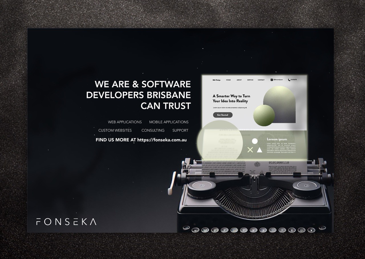
The design process involved creating an AI-generated typewriter, designing a simple website layout in Illustrator (using a common approach with large shapes for clarity), and then masking text on top of the design to create a typewriter-shaped website. Finally, I used Illustrator to design a website with a glossy glass effect emerging from the paper.
Some UX techniques used was to dimming the service list to keep things from feeling overwhelming. This highlight the company’s specs and action guides to make a strong impression, even at a quick glance.
This A5 poster was an enjoyable project that marked a milestone for me entering the industry and served as a checkpoint to review my graphic design abilities and skills.
